Ux/UI
Marsh
1
Project Brief
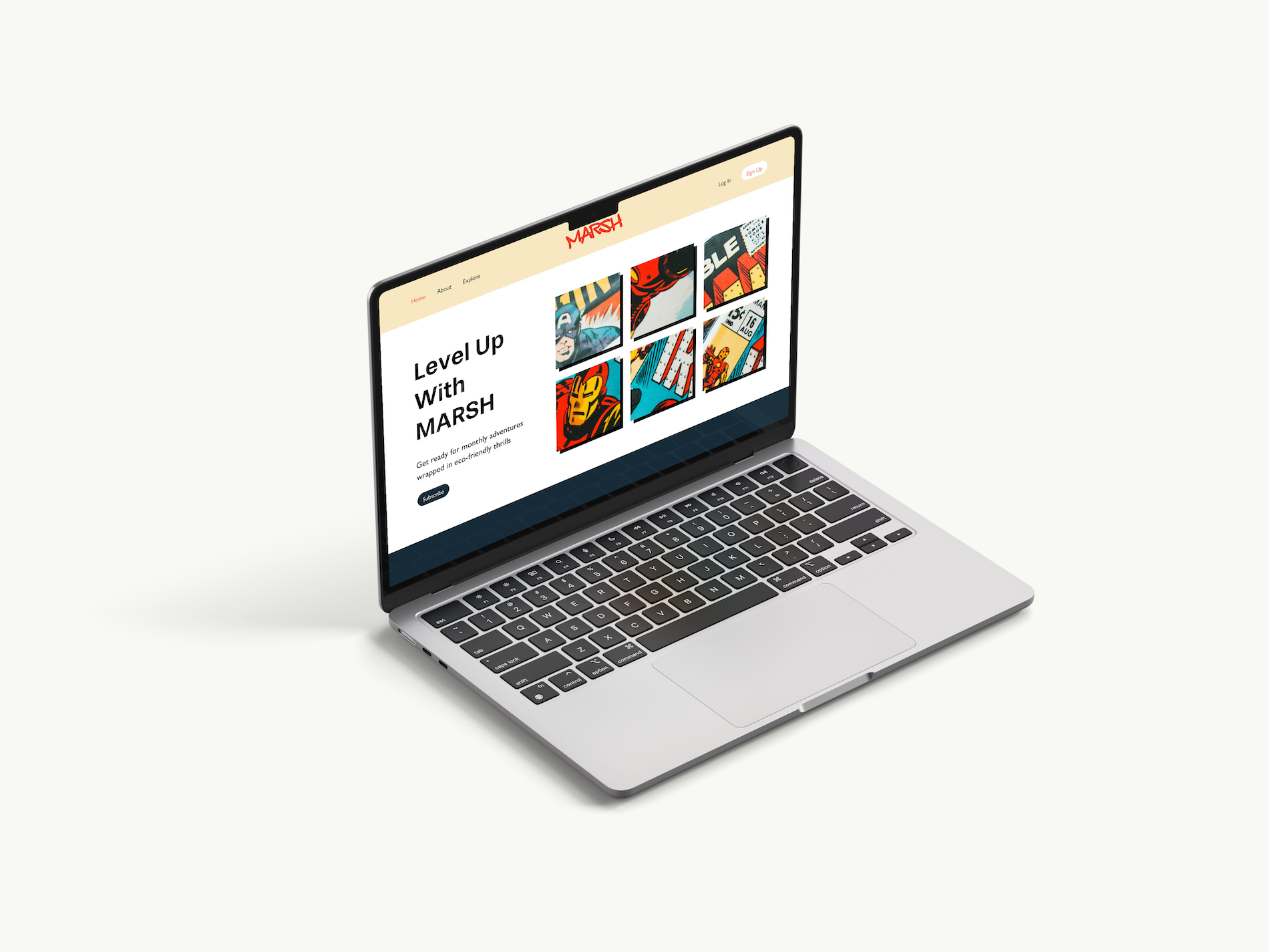
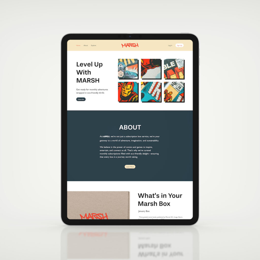
A responsive multi-page website was developed for Marsh, a subscription box service focused on comics and eco-friendly design. The project involved creating wireframes and prototypes, conducting market research, and implementing a user-centric design approach to engage the target audience.
Project Type
Academic
Contributions
Web Design | Wireframing | Prototyping | Responsive Design | UX/UI
Assets
Illustrator | Photoshop | Adobe XD | Figma | CSS | HTML
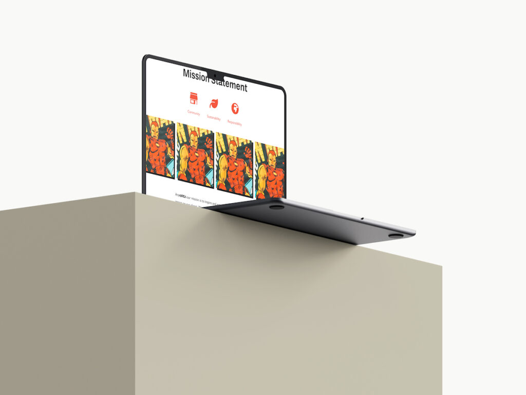
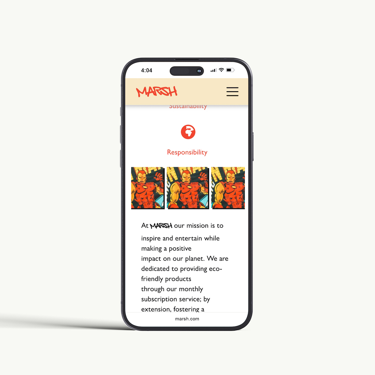
During the Marsh project, two key challenges were addressed: ensuring the design was fully responsive and simplifying the presentation of subscription options. Notably, the responsive design challenge was met by utilizing flexible grid layouts and fluid typography, ensuring the site maintained both visual appeal and functionality across all devices—desktops, tablets, and smartphones.
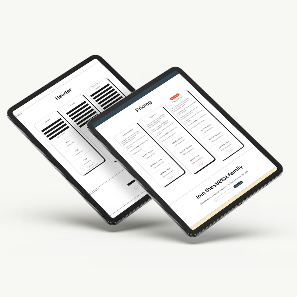
To optimize the presentation of subscription tiers, I applied user-centric design principles, focusing on intuitive navigation and interactive elements. This streamlined approach made it easy for users to select from monthly, quarterly, or yearly plans, enhancing the overall user experience. e
2
Challenges
3
Persona Development
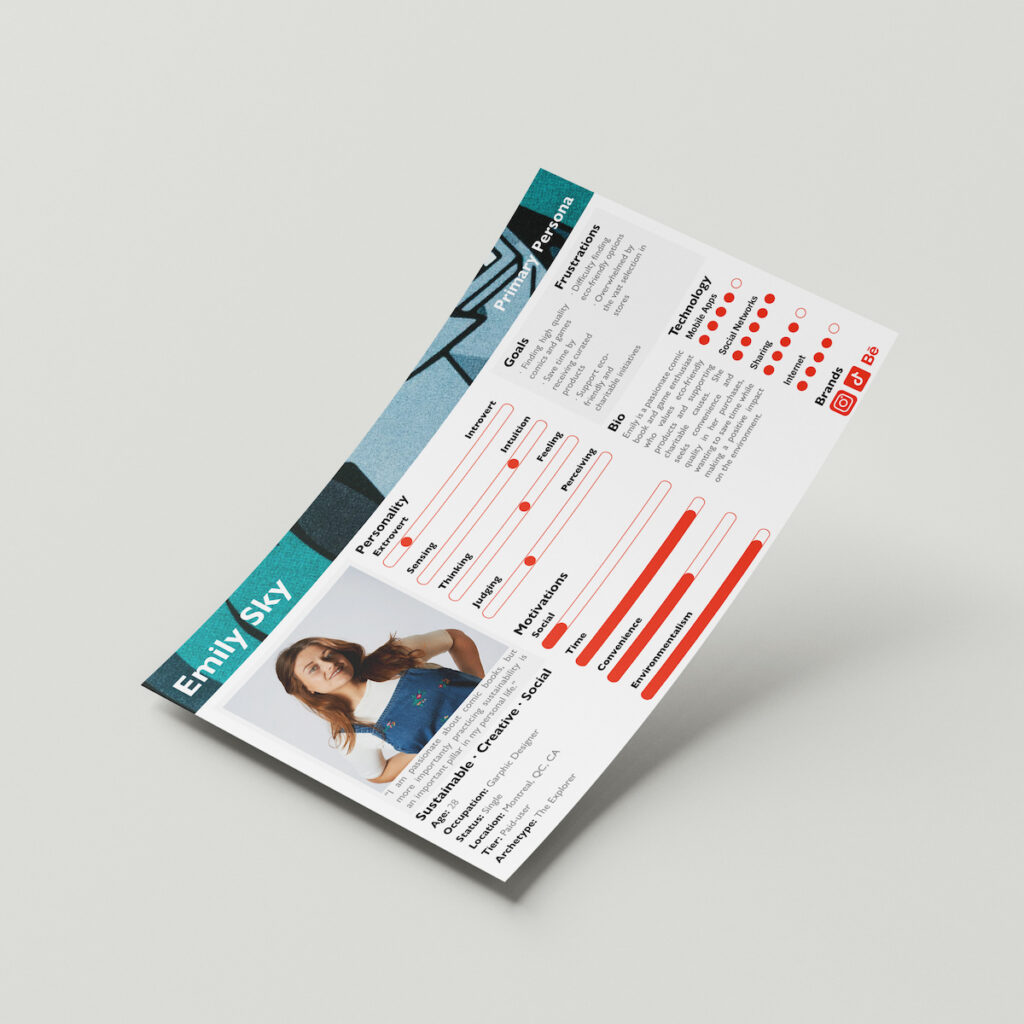
Comprehensive research was conducted to understand the target audience’s needs and behaviours. Through a combination of in-depth interviews, market analysis, and competitive research, a primary persona named Emily was developed, accurately representing the ideal customer. This persona served as a crucial guide throughout the design process, highlighting key preferences, interests, and pain points, ensuring the design remained user-centered. The strategic, research-driven approach not only informed the design but also ensured it resonated with the audience, delivering a compelling user experience.
4
Wireframes
Mid-fidelity wireframes were meticulously crafted to define layout, structure, and functionality. Through iterative refinement, low, mid, and high-fidelity prototypes were developed at each stage of the design process, ensuring the user-centric design stayed aligned with both functional and aesthetic goals.
5
Impact
The Marsh project focused on a user-centric, mobile-first approach to optimize the experience for the target audience. By carefully considering user needs and preferences, as reflected in the persona Emily, a seamless and intuitive subscription experience was created across all devices. The approach demonstrated my commitment to user satisfaction, accessibility, and creating inclusive digital experiences.
